
Mixing colors is hard. It’s a skill I’ve always been decent at but I’ve also never really dedicated time to getting better at it. I was an art minor in college and spent a good amount of time learning about color. So I know how to mix colors, I just never really cared to do it. And for a lot of people, it can be really frustrating.


I go to the art store most weekends. Even if it’s just to walk around and get out of the house for a bit. Recently, I started noticing more paint coming in CMYK sets. I even came across a watercolor set like this. I’m currently in the middle of a painting and decided it might be fun to switch things up a bit and I grabbed a few bottles of fluid acrylics to play with.
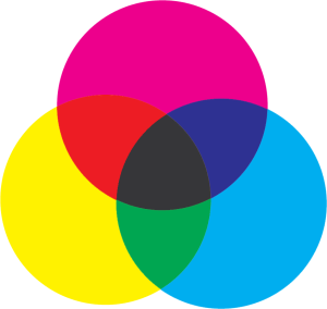

My whole life everyone has pushed RYB for color and I never really understood why. Even in art school they pushed RYB without even really mentioning any other color models, like RGB and CMYK. RGB is really used for light, like televisions and monitors and smartphones. CMYK is used more for physical objects where light is reflected off a surface. That’s why you’ve probably had an inkjet printer with 4 different color cartridges. In CMYK, Red and Blue are not primary colors, they’re secondary colors. Red and blue can all be mixed from CMY. Okay, I’m going off onto a tangent… this isn’t the point of this post.
Whether you want to mix with RYB or CMY, the process will be the pretty much same (though you may need to do some math to figure out the ratios in RGB). I chose to buy the CMY colors, so that is what I’ll be working with in this post.


I decided to use fluid acrylics for ease of measuring. I’ll be using blunt needles to suck up some acrylic right out of the bottle. I also grabbed a palette knife and popsicle sticks to do some mixing (depending on the container I’m using) and some white paint to use as a base. I also grabbed (not pictured) a gel base to bulk up my mixture.


You’ll also need some containers to store your paint in. I usually use these plastic Twisterz containers to keep my paint around until the end of a project. If it’s a color I really like or I’m doing a series of paintings that I foresee needing a lot of the same color, I use some empty paint tubes (and a tube wringer) to store my paint in so I can keep it pretty much air free.


I’m working from an image someone sent me when they requested I do a painting. Using an app called “Color Mixer” on android, I zoomed in and selected the color in the image to grab the color code. Most color apps will work and if you’re on a computer just about any photo editing software will give you a color code as well. This particular app gives the color in HTML Hex so I’ll need to convert it to CMYK.


A quick google search later, the website colorbook.io converted my Hex code to a list of other formats. I’ll grab the CMY color percents and get to mixing. You can ignore the K (black) percent.


Using my blunt needle, I’ll pull 29 units (depends on how you are measuring) magenta and deposit it into either into a container or onto a palette for mixing.
I do want to note that the percentage given in the CMYK chart above doesn’t add up to 100%. Those percentages are a percentage of coverage, not a percentage of total paint. I’m not spraying ink onto paper but I will still get pretty close to my goal color using these ratios as a guide. If you really want precision you could look into Pantone spot color formulas.


Along with those fluids, I’ll add a gob of white. Titanium White will lessen the transparency of the fluid acrylics and also give the paint body.
If you don’t care about the body of the paint, you can also just mix into white fluid acrylic, which will give you a pretty opaque fluid. This will be similar to painting with house paint and will leave minimal brush strokes on your canvas. It really depends on your preference and what you want the resulting texture to be.
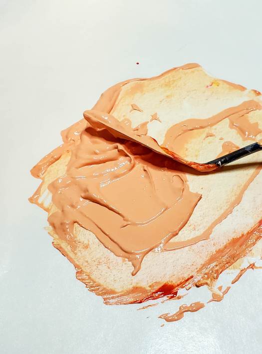

A quick mix later and I have my color. It’s at this point where I can change the brightness of the paint by adding more white or adding some black (a very tiny amount at a time). In person, the color was really close so I just left it alone. With the camera, I’m using and some adjustments in Photoshop, it looks like it is a bit too light here.

Then to bulk it up, I often will and a gob of medium to make sure I have enough for my project.


The problem with gel medium is that it will introduce more transparency to your paint. I normally have to put down 2 or 3 coats to get solid coverage with a heavy body paint straight from a tube. The addition of the gel medium usually means an additional coat.
The orange in the photo is 1 coat. I also did the yellow using this same method and that took about 3 coats.
The number of coats doesn’t bother me as long as I can get to the desired result. I like working in large solid colors so I am fine with additional coats of paint. Read the label of your medium, if you choose to use one, and keep the level of transparency it has in mind.